5 UI/UX Design Principles That Move B2B Enquiries
What this article covers
- 1. Removing friction before it appears in analytics
- 2. Using movement to direct attention
- 3. Designing an enquiry form people finish
- 4. Making it load fast enough to keep them
Most B2B sites do not lose enquiries loudly — they lose them one abandoned form at a time. Traffic is rarely the bottleneck; the interface usually is. A buyer who cannot find a specification, a price range or a direct way to ask a question will leave without saying why. The four changes below are the ones that consistently move enquiry numbers on the sites we build, and all of them sit inside interface design practice.
Start with the enquiry path itself. On most sites the drop-off happens in predictable places: a form that asks for company size before anyone has decided to talk, a services page that lists capabilities without saying what a project involves, a navigation menu that hides the contact page two levels down. The same pattern holds whether the buyer is in Sydney, Melbourne, and Perth or a regional town, and whether they are a factory manager replacing a scheduling spreadsheet or a marketing lead comparing three agencies. Very few of these fixes are technical. Most are decisions nobody has revisited since the site launched.
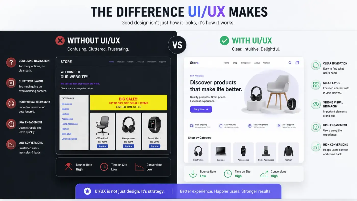 Figure 1: A journey map showing where visitors drop out between landing on a service page and sending an enquiry.
1. Removing friction before it appears in analytics
A visitor arriving on a service page is trying to answer three questions: what you do, whether you can do it for someone like them, and what happens if they get in touch. Every element that does not help answer one of those adds work for the reader.
Cutting that work is mostly a matter of editing : fewer competing calls to action, headings that say what the section actually contains, and body text at a size people do not have to zoom. Where there is a lot of detail to convey, put it in a table or a short list rather than a wall of paragraphs. A reader who can scan the page in ten seconds is far more likely to trust it than one who has to read it twice.
2. Using movement to direct attention
Motion is useful when it does a job. A panel that slides open confirms a click landed. A button that changes on hover signals it can be pressed. A section that eases in as it enters the viewport tells the reader there is more below. That is different from animation added because the page looked flat in a design review.
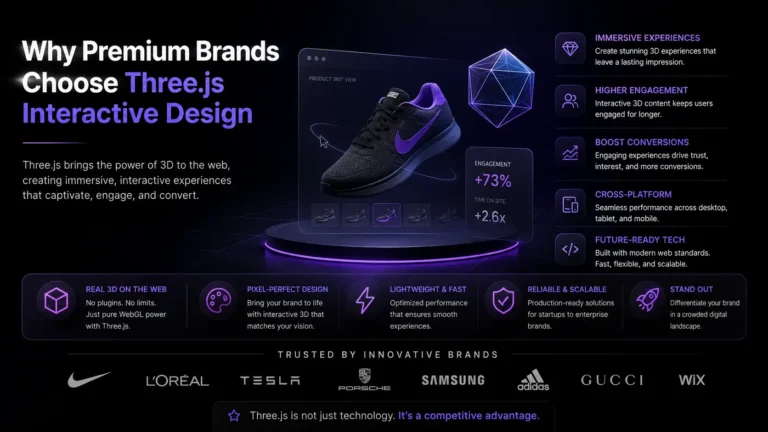
Where a sequence genuinely helps — a three-step process, a product that needs to be seen from an angle — use a short, eased transition rather than a linear one. The result is a reading order the eye follows instead of a page that simply moves. If you are working with richer visuals, the same rule applies to Three.js scenes: the scene loads in stages, the text stays in the HTML, and anyone who has asked their browser to reduce motion gets a static version that still works.
3. Designing an enquiry form people finish
The contact form is where most B2B sites lose an enquiry they had already earned. Asking a director or a plant manager for ten fields before they can ask a question is a lot of work for someone who has not decided to buy yet. In a competitive market like Australia, a long form is simply a reason to use the phone number instead.
The version that works is short. Name, an email or phone number, and a line about what the project is: three fields, one column, labels above the inputs rather than placeholder text that disappears as soon as someone types. If you need more detail, ask for it after the first reply, when the person has already decided you are worth talking to. Put the other routes beside the form as well — a phone number that reaches a person, a WhatsApp link, an email address that gets answered.
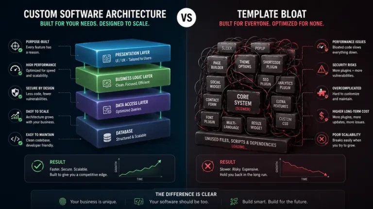
| What changes | The usual template site | Built around the enquiry |
|---|---|---|
| Form fields | Seven to ten, most of them optional | Three, all of them necessary |
| Navigation | Services hidden three levels deep | One level, with contact always visible |
| Interaction feedback | Nothing responds, or motion with no purpose | Short transitions that confirm an action |
| Effect on enquiries | Drop-off happens without anyone noticing | Measured step by step, so the weakest one gets fixed |
4. Making it load fast enough to keep them
A good interface is worth nothing if the page takes five seconds to appear. Speed and design are the same problem: the server, the images and the front-end code all decide how quickly someone sees the first useful thing. Google's Core Web Vitals guidance treats anything past a couple of seconds as slow, and visitors are less patient than that.
Most of the weight on a typical page is images and third-party scripts — chat widgets, tracking tags, font loaders. Compress the images, serve them at the size they are displayed, defer scripts until after the content, and audit what the marketing team has installed. When the page is still slow after that, the bottleneck is usually the server-side code. Queries that scan entire tables, pages rendered from scratch on every request and APIs called one after another all surface as a page that feels sluggish, and all of them are fixable.
Where to start
None of this needs a rebuild. Take the page that generates the most enquiries and read it the way a first-time visitor would: on a phone, on a slow connection, with no prior knowledge of what you sell. Note where you have to think, where you have to scroll back, and where you would have given up. That list is your priority order.
Have a page that is underperforming?
Send us the URL and tell us what it is supposed to do. We will look at the layout, the copy and the load time, and come back with the changes we would make first. If you want the background, read about our interface design work, or see how a custom build is put together from the data model up.